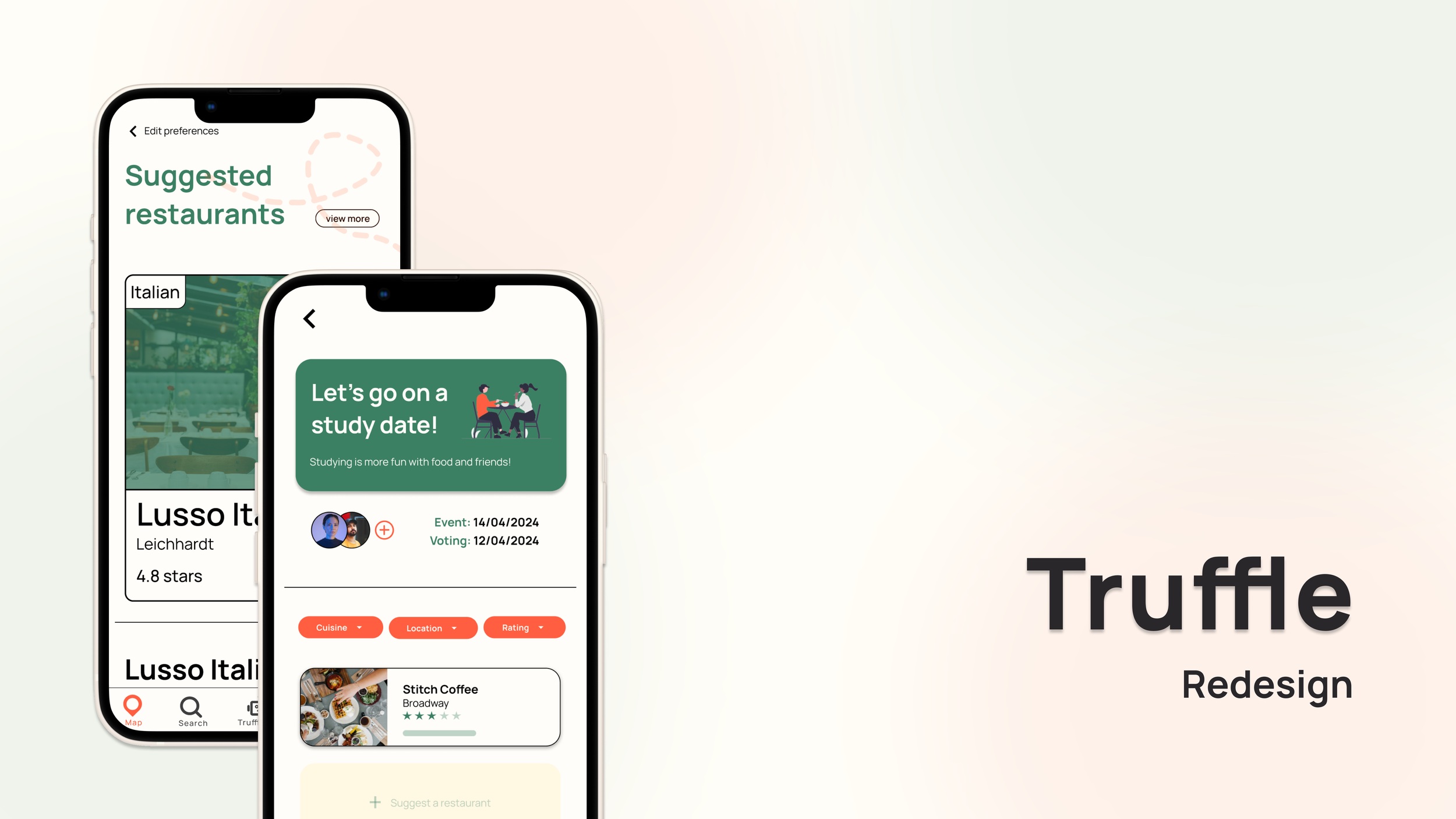
Redesigning: Truffle
Overview
Truffle is a social restaurant tracking app that helps users organise, track, and discover restaurants based on their preferences and social circles.
Following a redesign brief as part of the Prodigi’s Product Innovation Program, our team was tasked with enhancing existing features or introducing new ones to improve usability and engagement. Through user research and iterative design, we developed a refined experience that makes restaurant tracking more intuitive, personalised, and socially connected.
Duration | February 2024 - April 2024
Role | Product Manager, UX/UI designer, UX researcher
Tools | Figma, Canva
Design Brief
Truffle’s mission is to help food lovers organise their restaurant experiences and make them more accessible and useful. While the app allows users to track visits, create lists, and discover new spots, our research showed that cluttered information, lack of transparency in recommendations, and limited social engagement were key pain points.
Our challenge was to redesign Truffle by refining existing features or introducing two new user experiences to improve restaurant discovery, organisation, and social connection.
Problem Area
Background research
Gen Z and young millennials experience information overload when searching for restaurants. While social media platforms like Instagram and TikTok are popular for discovery, they lack structured tracking and organisation, leaving users with disorganised lists and no easy way to retrieve recommendations when needed. Many rely on bookmarking posts or taking notes, but these methods are inefficient and difficult to manage.
We analysed competitors to investigate key limitations in existing platforms. We identified a gap: current apps do not effectively integrate personalised discovery, structured tracking, and social engagement into a seamless experience. Our problem statement emerged from this—young adults seeking social dining experiences struggle with restaurant-tracking apps due to a lack of transparency, personalisation, and social connection, highlighting the need for a more intuitive and engaging solution.
User Research
Our research aimed to understand how users store and value restaurant information, determine the trustworthiness of food recommendations, and assess the role of social connection in dining experiences. We also explored how the lack of differentiation between food tracking apps impacts user engagement and satisfaction.
Methodology
To address these questions, we conducted a triangulated research approach, combining a questionnaire (100 responses, with 73 participants aged 18–34), contextual inquiries, and interviews. The questionnaire provided broad insights into user behaviours, the contextual inquiry allowed us to observe real-time interactions with Truffle, and the interviews helped to deepen our understanding of user motivations and frustrations. This comprehensive method ensured the credibility and relevance of our findings.
Data Analysis
To extract meaningful insights, we used affinity diagramming to categorise themes from surveys, interviews, and contextual inquiries.
Key insights
Refined problem statement:
Young adults who value social dining experiences and trying new restaurants are disappointed by current restaurant-tracking options due to their lack of information, transparency and convenience. These feelings are exacerbated by an unmet need for visually-driven tracking applications that not only facilitate restaurant discovery but also encourage meaningful social connections.
Personas
We developed a persona to represent our target users, ensuring our design addressed their needs, behaviours, and challenges.
Ideation and User Testing
We explored concept ideation through brainstorming and Crazy 8s, generating a wide range of ideas before refining them through sketches and mockups. To ensure we selected the most effective solution, we evaluated our concepts using a decision matrix, allowing us to assess feasibility, user impact, and alignment with our research insights.
Feature Redesign & Enhancements (Low-fidelity)
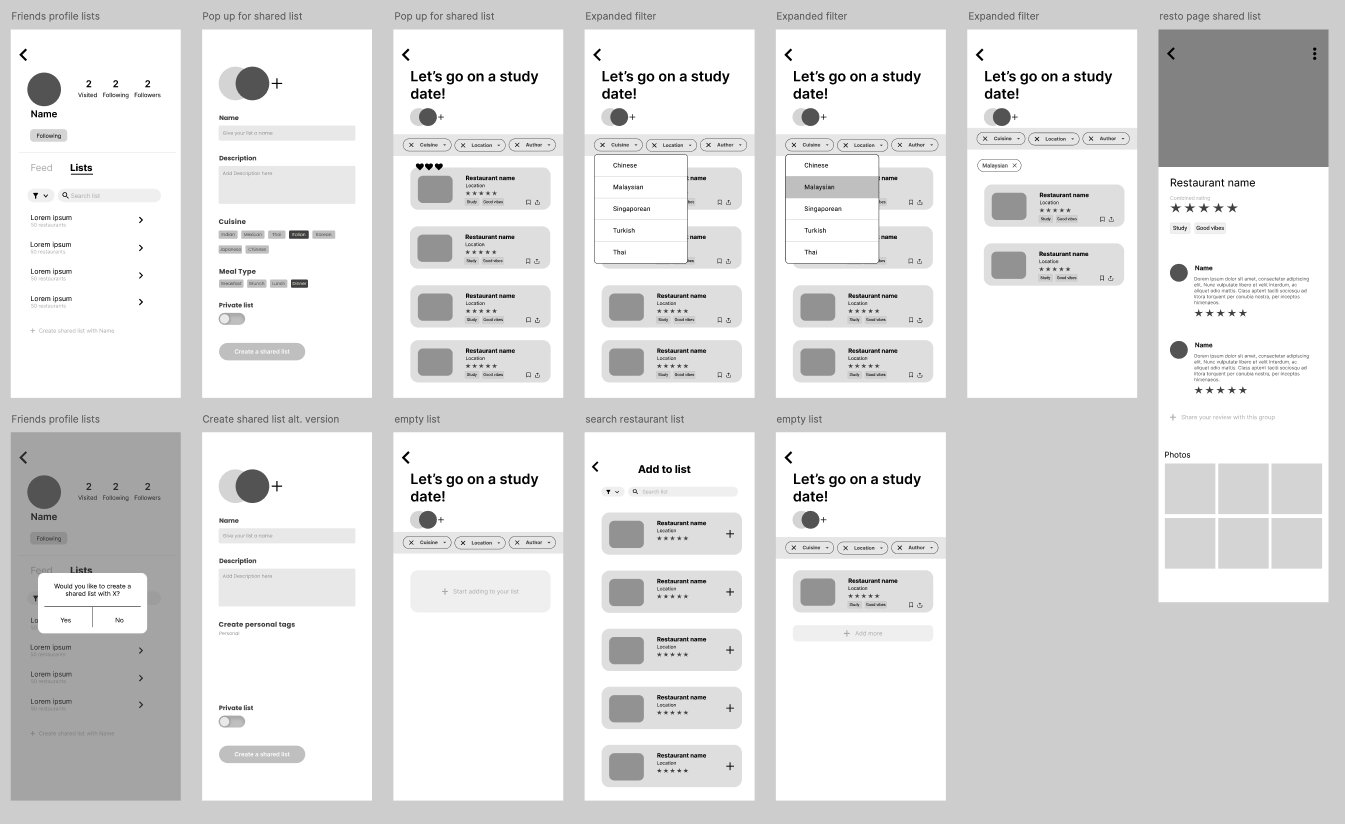
We then developed our sketches and two concepts into wireframes using Figma. Alongside with the wireframe, we created an accompanying user journey map that showcases that feature.
Shared Lists & Event Planning
To make group dining decisions easier, we developed Truffle Events, allowing users to:
Collaborate and vote on restaurants.
Auto-track visits and upload photos to shared lists.
Plan and organise dining experiences seamlessly.
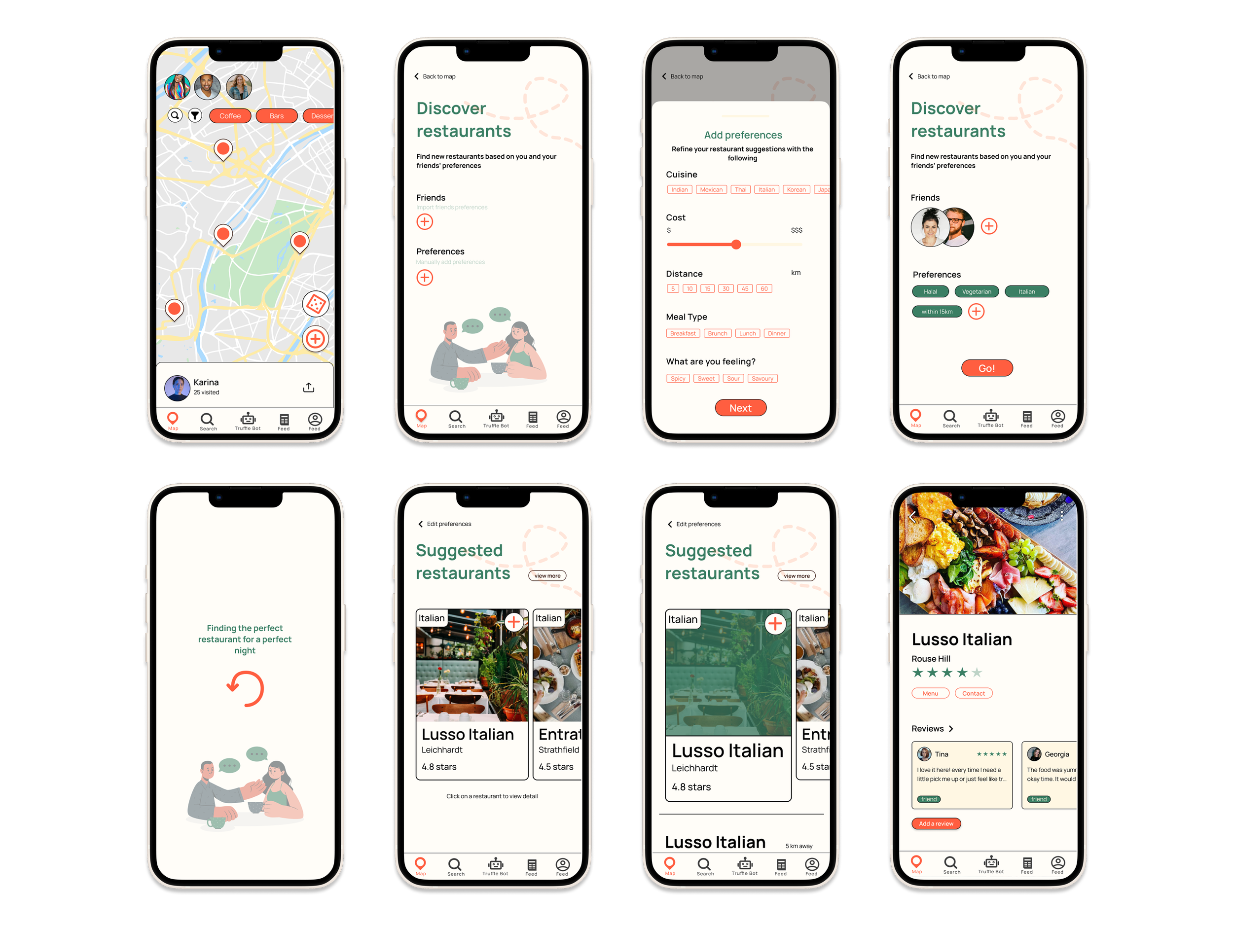
Truffle Shuffle (Smart Restaurant Discovery)
For users facing decision fatigue, we created Truffle Shuffle, a smart recommendation tool that:
Suggests restaurants tailored to personal and group preferences.
Simplifies the selection process, reducing search time.
Factors in friends’ dining history for collaborative decision-making.
Both features enhance usability, personalisation, and social connection, making Truffle a more engaging experience.
High-fidelity user testing
For our high-fidelity prototype, we conducted user testing and heuristic evaluations with 10 participants to assess usability, efficiency, and overall user experience. This process allowed us to identify pain points, refine interactions, and enhance clarity, ensuring our final prototype was both intuitive and aligned with user expectations.
Improvements on the UI & navigation are:
Increased contrast for buttons to enhance visibility.
Simplified the back button, replacing it with an automatic return feature.
Optimised the experience flow, ensuring seamless navigation across Truffle’s digital and social components.
Our final usability test resulted in an SUS score of 92.1, confirming significant improvements in engagement and overall user satisfaction.
Final high-fidelity prototype
After a final round of user testing and refinements, we incorporated constructive feedback to enhance our high-fidelity prototype, particularly in the UI of the digital component. While users responded positively overall, their insights helped us make final adjustments to improve clarity, usability, and engagement. With these refinements, we completed our final high-fidelity prototype, ensuring it effectively aligns with user needs and delivers a seamless, engaging experience.
Final Prototype
Reflection
My experience in Prodigi, with a collaborative team, has been a valuable journey, allowing us to grow both as a team and as designers. We bonded through meetups and got to know each other beyond our work. We also improved our Figma skills, creating interactive prototypes that we can proudly showcase in our portfolios. However, our Prodigi journey wasn’t always smooth. We faced challenges in working consistently, especially after the mid-semester break, when motivation was harder to maintain. Scheduling meetings that worked for everyone was also difficult, as we had to juggle university, work, and personal commitments.
Working on a real-world app redesign gave me valuable insight into improving existing digital products - an experience quite different from building an app from scratch. It challenged me to deeply understand user pain points within an established system, evaluate what was and wasn’t working, and strategically enhance features without disrupting the existing user flow. Through this, I developed the ability to balance constraints with creativity, identify scalable improvements, and approach design not just from a blank slate, but through refinement and iteration. We also learned a lot about presenting to stakeholders, using storytelling to craft engaging and compelling design pitches.


